M1, M3 or M5 – these model names of the BMW M sub-brand find a warm response in the hearts of many car enthusiasts. The colors of the BMW M emblem are just as familiar to everyone. But why these colors? And who came up with this trademark distinctive sign?
The fact that the “M” in the BMW M stands for “Motorsport” is known to all car enthusiasts without exception. But where did BMW’s sporting division get its colors from? The Bavarian blue is obviously borrowed from the BMW emblem (➜ Read also: BMW emblem history), but where did the purple and red come from? And how did the BMW M emblem get its familiar look? To find out more, we go to the BMW Group Classic archives.

BMW M GMBH COLORS ARE THE RESULT OF A JOINT PROJECT.
Every success story has its legends. The history of the BMW M emblem and colors is not without them. In 1972, the following BMW employees were involved in the color scheme for the BMW sports division: Jochen Neerpasch (at the time head of the racing program and co-managing director of BMW Motorsport GmbH), Wolfgang Seehaus (former BMW interior designer) and Manfred Rennen (former BMW exterior designer).
The BMW M GmbH division was founded in 1972 to develop sports products for the BMW brand. At that time, it was officially called BMW Motorsport GmbH – and only in 1993 was it renamed to BMW M GmbH.
The new division was to unite and professionalize all of BMW’s activities in the field of motorsports. The unification and professionalization, among other things, implied the single unified corporate style. A clear and expressive color scheme was to become a unifying element. The designer Wolfgang Seehaus was one of those responsible for the color unification: he created the colors of the BMW M – a combination of blue, purple and red.
Blue symbolizes the BMW brand, red symbolizes motorsports, and purple symbolizes their unique connection.
THE BMW M EMBLEM: A SYMBOL WITH HIGH BRAND RECOGNITION.

Mark Tisbürger, automotive and motorsports historian at the BMW Group Classic, has access to various archival sources and the surviving memories of those involved in those events. That’s why his interpretation of the chosen color combination sounds a bit different: “Blue is a BMW symbol, the inspiration for red was probably Texaco, and purple was chosen purely pragmatically as a mix of blue and red. When asked about the Texaco story, he said the following: “Red got into the color scheme of BMW Motorsport in all likelihood because of Texaco, although sponsorship negotiations with Texaco in late 1972 failed, and the deal never came to fruition in the end.”
Nevertheless, Tisbürger considers this explanation quite possible, since already in 1972 designer Wolfgang Seehaus had included the Texaco logo in new racing car designs. This is confirmed by numerous design sketches in the BMW Group’s archives. That is, he did so at the very time when BMW’s racing performances were under the auspices of Castrol, whose logo is known to be green. Although, as Tisbürger notes, such a situation already looks unusual in itself – to introduce red into the sketches in advance, when negotiations about cooperation have only just begun. On the other hand, it could be seen as a kind of “flattery” to get Texaco on its side.

Manfred Rennen, a colleague of Seehaus, mentioned that he, too, was involved in the development of the colors. But, as Tisbürger points out, there are no historical documents in favor of this version. And while Jochen Neerpasch confirmed “the enduring legend of Texaco,” in contrast, Rennen once denied that Texaco played a role in the choice of colors.
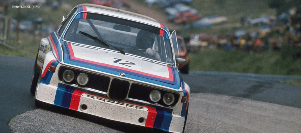
RACING DEBUT IN THE BMW 3.0 CSL.
Wolfgang Seehaus chose this color combination not least because they can be clearly distinguished in black and white photos. That was the explanation, at least, given by the former head of the BMW racing department, Jochen Neerpasch. And BMW M’s official stance on its signature colors is as follows: “Blue symbolizes the BMW brand, red symbolizes motorsport, and purple is their unique connection. If you replace purple with navy blue, this statement is still valid today.
The colors of the BMW M(otorsport) lead us to the conclusion: everything is brilliantly simple. Rarely does a color combination do so much for brand image and recognition.
Mark Tisburger
The three-color BMW M emblem quickly took its place on the race cars of Bavarian Motor Works. The racing debut of the corporate color style took place in
1973 on the BMW 3.0 CSL, which, among other things, became a BMW icon due to its “striped” design. The author of the final design of the car, according to Neerpash, was freelance graphic designer Pierre Mendell. In collaboration with BMW designer Manfred Rennen. To this day, the cars of the racing division carry stickers in the famous M colors – only the appearance and size vary.
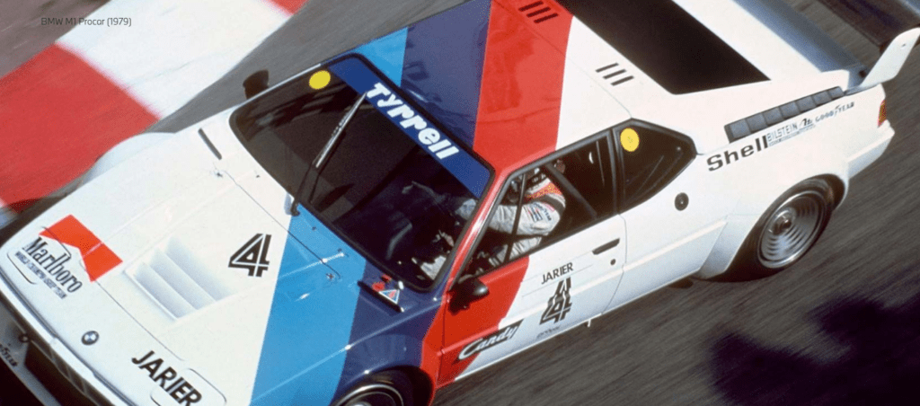


Another interesting fact that is often forgotten: the color design of the BMW M with blue, purple and red appeared much earlier than the combination of the same colors and the letter “M”. While the colors have been used on BMW M models since 1973, the letter “M” as part of the emblem was first introduced at the presentation of the BMW M1 in 1978 – it was the first car developed by the BMW M GmbH division. Since then, the tricolor and the letter “M” have formed an integral whole and are featured as a trademark on all BMW M cars. Since 1973, BMW has used the BMW emblem with alternating segments in concentric circles around it for its motorsport events. According to Jochen Neerpasch, the design was developed by the Swiss graphic design agency Müller.
THE BMW M EMBLEM IS A SYMBOL OF POWER.
Since 1978, the emblem in the form of the letter “M” with the three bars leaning against it was used. The inclined position of the stripes was intended to emphasize the speed and dynamics of BMW M models. This legendary logo, developed by Italdesign under the direction of Giorgio Giugiaro, is also known as the “M Giugiaro”.
Over time, the design of the BMW M logo and stripes has been carefully refined. Thus, from the former purple, the color has long since become a dark blue. The last update of the corporate design took place in March 2020. Since then, the BMW M communication logo in the new style has been used for the brand’s information and promotional materials. It has abandoned the three-dimensional image, and the logo is now made in two-dimensional graphics in four colors – blue, navy blue, red and white (the letter “M”).

THE FUNDAMENTAL INVENTION OF THE BMW M.
The history of the origin of the BMW M(otorsport) colors is ambiguous. One thing is clear: BMW designer Wolfgang Seehaus played one of the leading roles in it. BMW designer Manfred Rennen also had his hand, at least in the design of the stripes. It is also a well-known fact that the first BMW sports emblem was created by the graphic design bureau Müller, while the final racing car design with stripes was developed by the design studio of Pierre Mendell. Thus, it was a collaborative project.
BMW Group Classic expert Mark Tisbürger adds: “The creation and use of BMW M(otorsport) colors can be considered a fundamental invention in the field of corporate styling. This is confirmed by the fact that the colors and emblem were carefully refined without any major changes to the basic 70’s design. Why was this necessary? Because now not only motorsport fans, but everyone else knows that only the sportiest BMW models carry the BMW M logo.
How did the colors and emblem of the BMW M come about?
The origins of the blue, purple (today dark blue) and red colors of the BMW M go back to 1973 and the then head of BMW’s racing division, Jochen Neerpasch, as well as BMW designers Seehaus and Rennen. It is certain that the first BMW sports emblem was created by the graphic design bureau Müller, while the final stripe racing car design was developed by the design studio of Pierre Mendell.